Get our weekly updates, including high-value tips and free resources that will help you take your design career to the next level.


When you design your first website or even a single landing page, it’s tempting to jump right into your design program and start designing. Why take the time to create a wireframe? You’ll figure it out as you go. But this is actually a huge mistake. Taking the time to wireframe your website will save you so much time when it comes to mocking up the design and getting client approvals. Let’s dive into what wireframing is, learn from other wireframes examples for web design, and how to create your own wireframes if this is your first time creating one.
🤑 FREE Web Design Workshop 👉 Enroll Now! 🤑
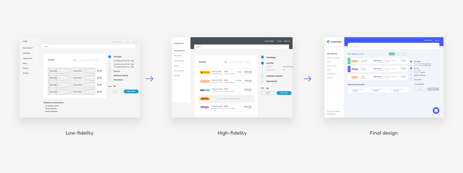
Wireframes are created at the beginning stage of a web design project. After you gather research, inspiration, and align on a business goal with the client, you transform this information into a wireframe (designers often you pre-made UI kits to speed up this process). These wireframes become a map for how you communicate the design evolution with your client. Take a look at this diagram to see how a website design evolves from a low-fidelity to high-fidelity wireframe to the final UI design mockup.
Check out this video where Ran walks you through what wireframing is and why it’s an important step in the web design process.
Whether you’re starting with a sketch or working on a high-fidelity wireframe mockup will determine how detailed the elements you include are. For example, on a sketch or a low-fidelity mockup, you’ll use boxes to divide up the page and use lines to indicate where headlines and body copy are. You might shade in a box or connect the corners in an X to indicate an illustration or photo.

On a high-fidelity mockup, you might start to include Lorem Ipsum text to really show the scale and placement of typography. You might use varying shades of gray to show different types of content, possibly add one color to help highlight certain elements, like in this wireframe example below.

Whether you’re designing a few landing pages or redesigning an entire website, a wireframe will help you save time. Let’s say a client wants to add a new section to their product shop pages. You can come up with various solutions to solve this one problem by iterating wireframes.
Change the layout, change the hierarchy, think about different ways to solve this one specific problem. Then you can present these to the client to get buy-in before you work on the final design. The most important thing with wireframes is to get client and stakeholder approval first, so you don’t waste time designing the wrong solution. When you’re a freelance designer, time is money and if you haven’t carefully laid out a plan for rounds of revision in your initial contract, it may come out of your bottom line.
If you’re wireframing solutions to solve a specific problem, try Crazy Eights. To do this, fold a piece of paper in and in half again. When you open it, you have either rectangles. Spend one minute sketching out a quick wireframe in each section. When you’re done, it might look something like the example shown below.
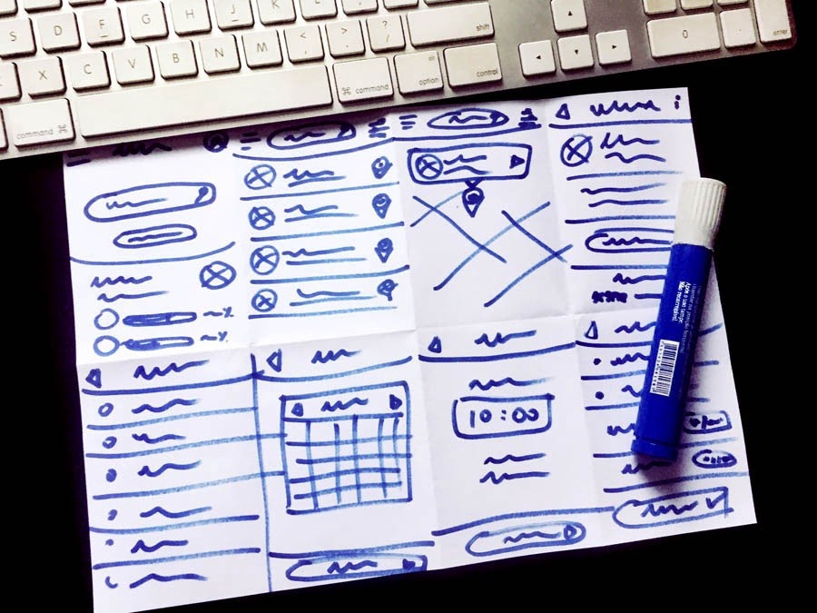
It’s ok if your Crazy Eights are messy. All that matters is you came up with eight possible solutions. You can then expand upon your best ideas in a more detailed wireframe.
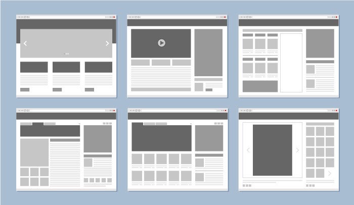
Now you know what a wireframe is and why they are important, let’s get into some visual examples. You may have noticed there are different types of wireframes. Is one better than another? Not necessarily, it all depends on the stage you are in for your design project. It’s totally ok to start with sketches and progress from there.
No matter how seasoned of a designer you are, sometimes it’s just easier to get out an old-fashioned pen and paper to sketch and get those first ideas out fast. They can be as messy or as neat and detailed as you prefer, here are a range of examples.
This one is pretty loose and basic, there’s not too much detail but we have a clear idea of structure and form.

This example is much more organized, the designer even took the time to create annotations, noted by a numbered circle highlighted in yellow. Little details like this will help you communicate better with a client or stakeholder.

Using graph paper can be a great resource in sketching wireframes, the squares will help you draw straight lights and do quick math when thinking about the grid and how to divide up the page. You can take it one step further by using a light gray market to add shading and add contrast for a better presentation experience.

This wireframe sketch is quite detailed. If you love to sketch or find it quick and easy, this might be how you want to create your wireframe sketches or you could wait to add more detail in the next phase, low-fidelity wireframes.

This is another example of a detailed wireframe sketch example but it begins to show a user flow by connecting one landing page to three more. This is the power of wireframing at work, it helps you see the bigger picture when designing an entire end-to-end digital experience.

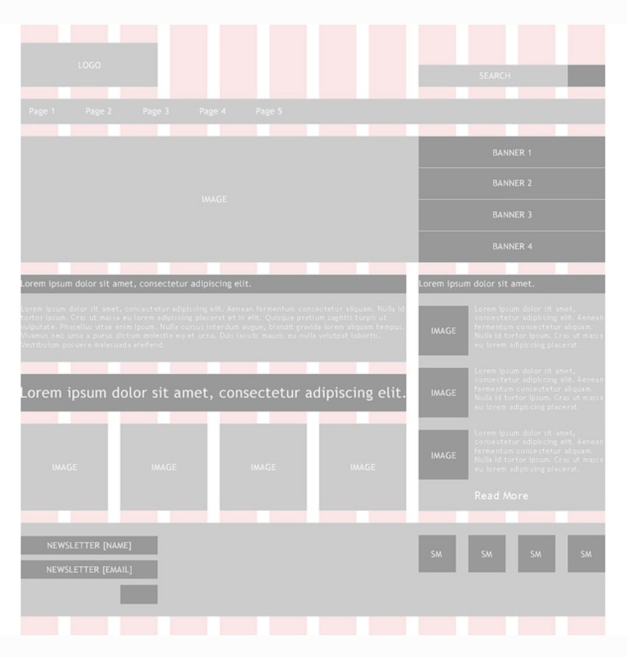
In this wireframe example, the designer created a grid and uses it to divide up information and design elements across the 12 columns. Nailing down the grid system before you head into design will save you time later.
To learn more about grids, check out this article on How to use a grid in web design.
Here’s a simple low-fidelity wireframe using mostly lines and outlined boxes to indicate where the logo, hero image, and supporting images are. Body text is shown in a box tinted in light gray.

This low-fidelity wireframe uses shades of gray to indicate a hierarchy of importance for specific elements. You can also see a good use of white space and a grid hard at work.
This example shows a simple flow for a music app. It’s minimal, there’s not much detail yet, but we already understand how it works from these low-wireframe mockups.
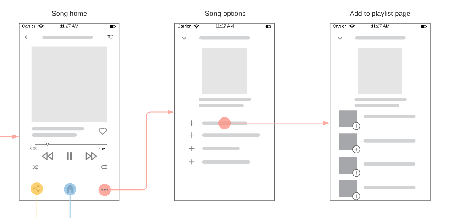
This wireframe example helps to show how a user journey maps out across multiple screens. Consider how your individual wireframes interact with each other by connecting one to another in a flow like this.

High-fidelity mockups show a great range of detail as you get closer to mocking up the final design. At this stage, you might be using real copy in headers and sub-copy while body copy might still be a placeholder.
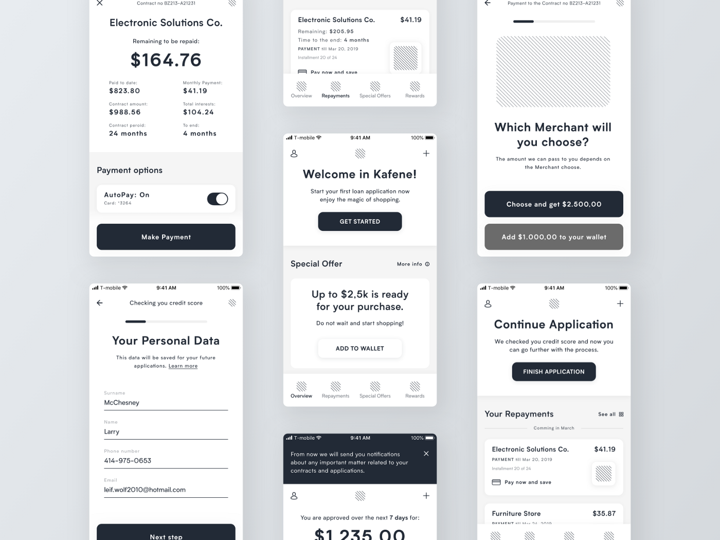
Check out the details in this high-fidelity wireframe mockup for a mobile user flow. The content and organization are nearly finalized which is a great place to be before design.
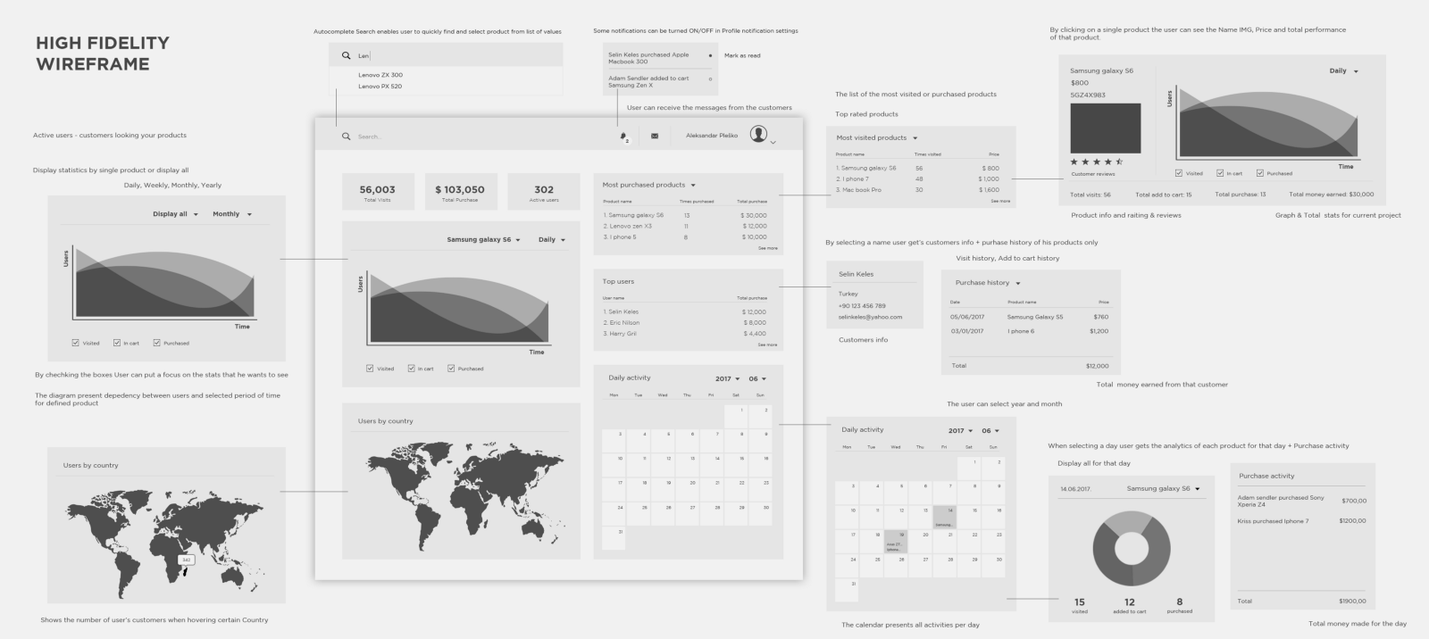
This high-fidelity wireframe example includes charts and maps to convey important time facts and statistics.
In this wireframe example for a landing page, we see content is clearly divided into various sections. In the header section, we have an H1 header, a subhead, one call-to-action button, and a placeholder for an image to the right. You can see the page uses a 3-column grid, evident in the following two sections. When you’re creating your wireframes, think about the grid and use it to make the content more digestible.
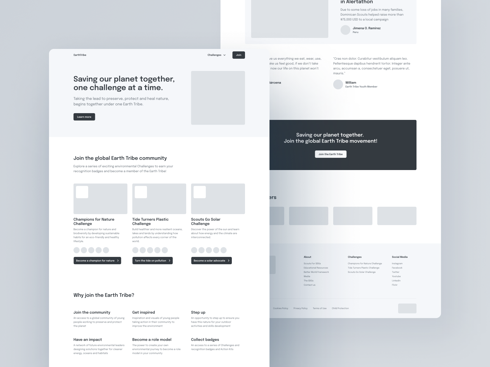
It can be helpful to add one color at this stage of wireframing. Notice the minimal yet strategic use of green in this mobile wireframe example.
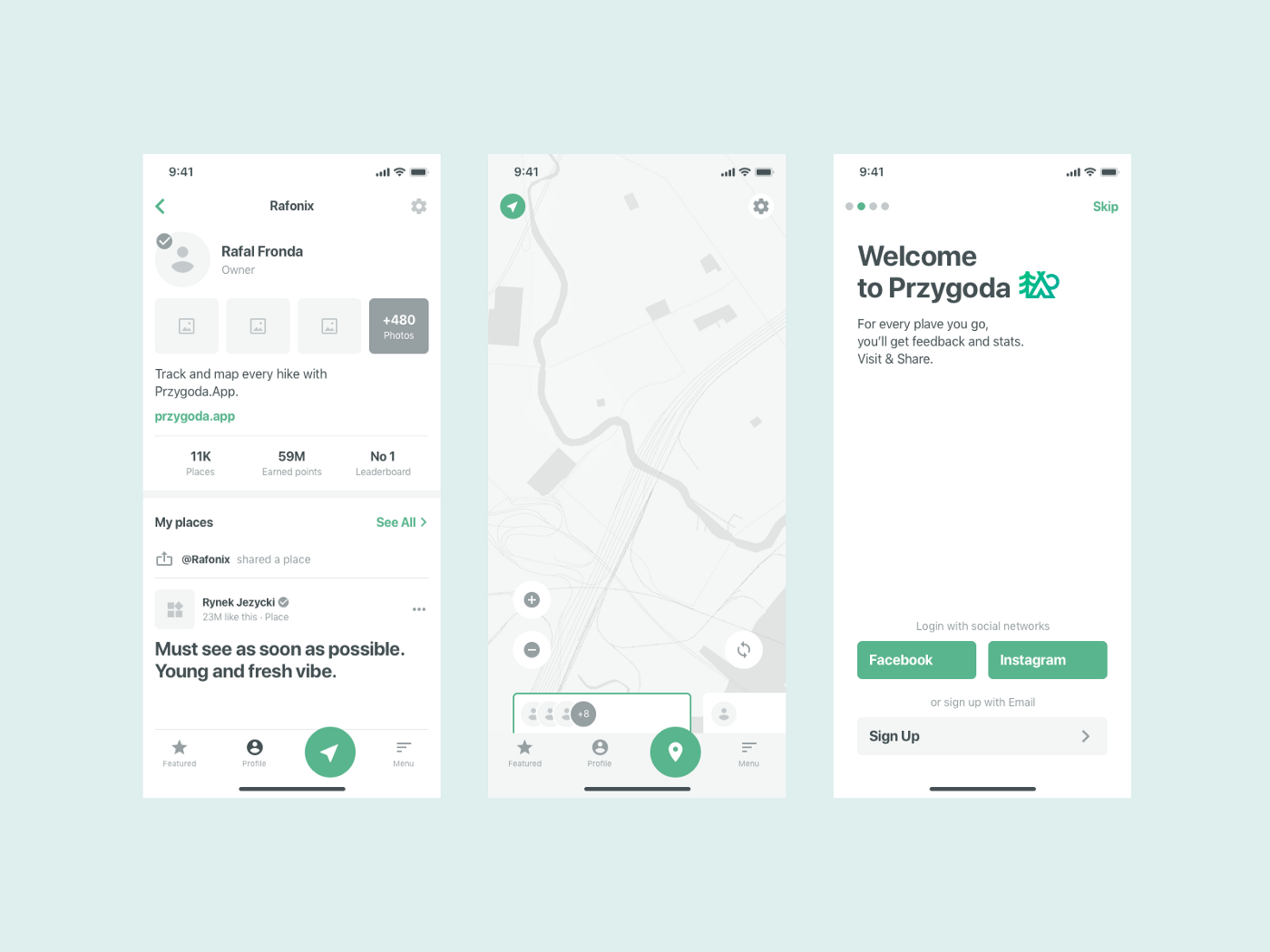
This wireframe example uses blue as the main highlight color and real copy to show how a signup landing page will look.
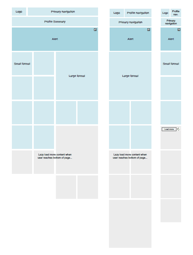
Wireframing can also help you design responsively across desktop, tablet, and mobile devices. While most would suggest designing for mobile-first, think of it as a collapsing system. Notice on the multiple columns mocked up on desktop collapse to one on the mobile device.
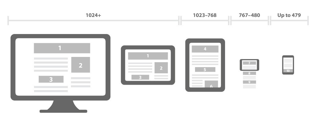
Here’s another example to show how wireframing ranges across devices. The grid switches from 4 columns on desktop to 2 columns on a table and to one single column only on mobile.
If you want to learn more about wireframing, check out our post the Beginner’s guide to wireframing for web design. Or check out more from the Flux blog for more articles on web design, Webflow, and freelancing.
If you’re looking for in-depth video tutorials on design, check out our YouTube channel where we publish new videos weekly.

Check out the Flux YouTube channel
If you want to learn more about the web design process from start to finish, consider checking out our program The $10k Website Process. You’ll discover a step-by-step process to design beautiful, high-value websites that achieve strategic goals for your clients. Master the art and strategy of website design, and increase the value of your services, as well as your rates.


Get our weekly updates, including high-value tips and free resources that will help you take your design career to the next level.