Get our weekly updates, including high-value tips and free resources that will help you take your design career to the next level.


Website navigation refers to the link structure and hierarchy of a website. The purpose of it is to guide users to where they want to go in as few steps as possible. In addition to user experience, website navigation also contributes to SEO, or search engine optimization.
When search engines index a website, they rely on the site's navigation in order to understand the context of each page and how they relate to one another. Confusing navigation is a red flag to search engines because it indicates a poor user experience.
🤑 FREE Web Design Workshop 👉 Enroll Now! 🤑
The primary goal of website navigation is to create a streamlined user experience. This is especially important for larger websites that have many subpages spread throughout multiple higher level category pages. The secondary goal of website navigation is SEO. Since user experience and SEO go hand-in-hand, optimizing one is usually beneficial for the other; however, creating a clear and streamlined user experience should always be priority #1 for web designers.
Check out this post to learn more about the important relationship between web design and SEO.
In this post, we'll take a deep dive into the best practices for clear website navigation that is both user- and SEO-friendly. Before we get started, check out Ran Segall's video below from the Flux YouTube channel for a brief introduction to structuring website content.
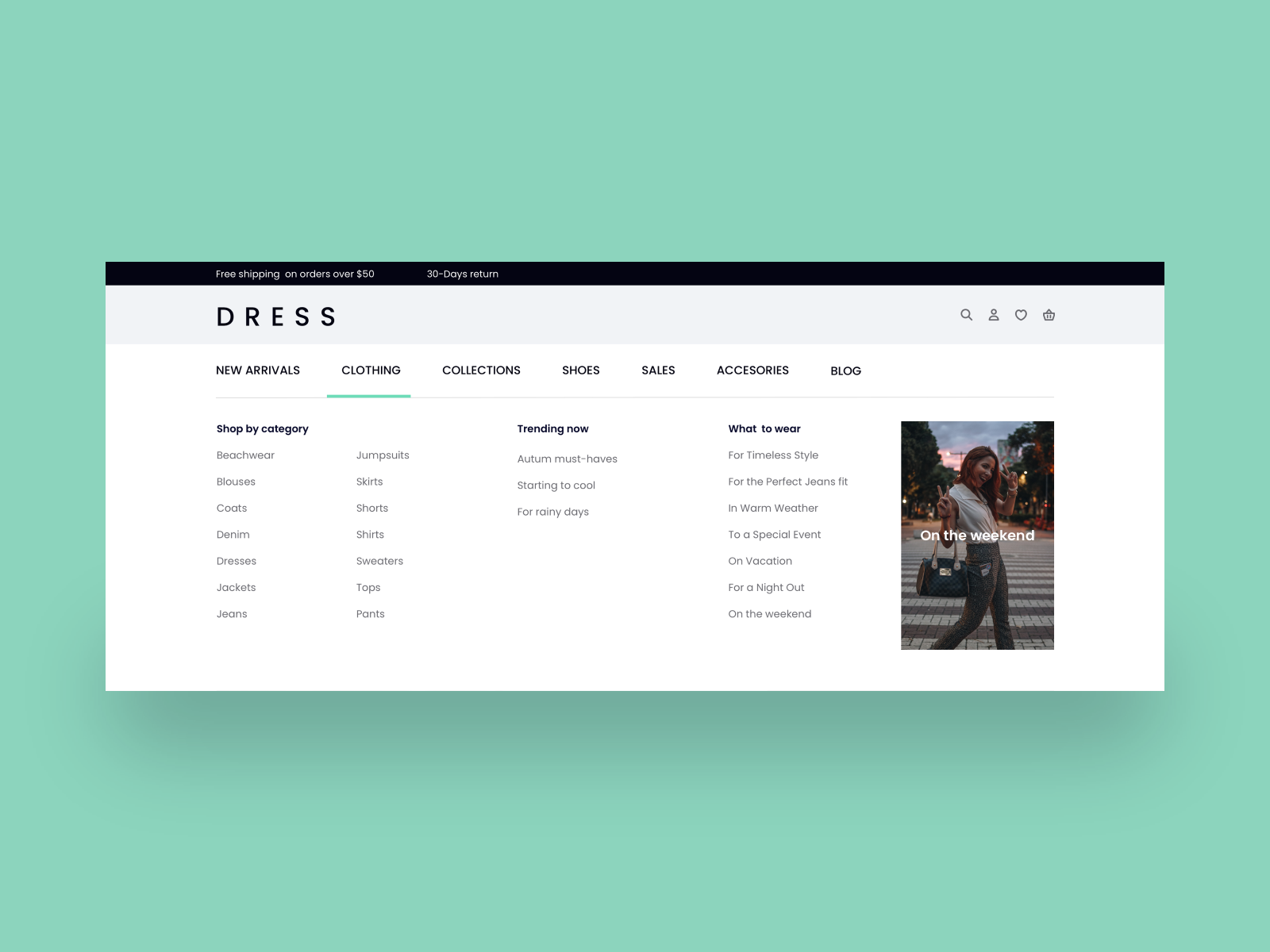
When you picture website navigation, what comes to mind? Most people immediately think of the main navigation bar that sits at the top of every website. But in fact, the top menu is just one of the four primary types of website navigation. Let's take a closer look at each type.
The top menu, or main menu, is the primary website navigation bar that's positioned at the top of every website. Typically, the logo is positioned on the left and links to the homepage, while the rest of the navigation is positioned on the right. In some cases, the main menu is located on the side of a website; however, most people expect to find it on the top right corner, which is therefore the ideal location in terms of user experience.

The second type of website navigation is the footer menu. Some websites have an in-depth footer menu, whereas others keep it simple with only a handful of pertinent links. Neither approach is inherently right or wrong; the optimal solution depends on the goals and complexity of the website.

In most cases, it's considered good practice to include links in the footer menu to the most important pages on the site. Some people scroll all the way to the footer menu if they can't easily find what they're looking for in the top menu or within the page content itself. At minimum, a website's footer menu should include links to legal pages and a way to get in touch with the site owner.
A third type of website navigation that is often seen on ecommerce and other content heavy sites is a sidebar. As the name suggests, sidebars are positioned on either the left or right side of a page. A familiar example of sidebar navigation is the classic blog layout, where the content is on the left and the sidebar on the right. In this example, the sidebar typically takes up about 1/4 of the width of the page.
Sidebars are typically used to categorize content, such as articles or blog posts. Important, top-level page links are better positioned in the top and footer menus, where they are more visible in comparison to the sidebar.
The fourth type of website navigation is called breadcrumbs. These are hierarchical links that show how pages are nested within each other. Breadcrumbs are commonly seen on blogs and ecommerce sites. They're useful for helping users navigate within a specific category of interest.

Now that we’ve covered the four main types of website navigation, let’s dive into some best practices. The following seven principles will help you design navigation that is both intuitive for users and easy for search engines to index.
Most of the time, in the context of user experience, simplicity is key. This is especially true for website navigation. As we discussed earlier, the main goal of website navigation is to get users to where they want to go in as few steps as possible. A cluttered or overly complex navigation can cause confusion or uncertainty; in the worst case scenario, the user will exit out of the site completely if they can't find what they're looking for quickly.
If possible, it's best to limit the main navigation menu to no more than seven links. In addition, avoid the use of dropdown menus, which can be difficult for search engine bots to crawl.

However, there is one exception to this rule called the mega menu. A mega menu is essentially a large dropdown menu that displays a collection of categorized links. The key to success with a mega menu is the categorization; without categories, the menu is just one large and overwhelming collection of links. Mega menus should only be used for organizations with large sites, such as ecommerce stores, universities, and corporations with multiple subdivisions.
One of the fundamental principles of website navigation design is to make it visible. Although it sounds intuitive, many website designers make the mistake of sacrificing visibility in favor of edgy, creative layout design. If you want to design a nontraditional layout, it's important to still keep usability in mind, unless the purpose of the website is purely artistic.
There are a few different ways to ensure that the navigation on a site is visible. The first is placement; as mentioned earlier, most people expect to find the main menu in the top right corner, just like they expect to find the footer menu at the very bottom of the page.

Another way to ensure visibility is with contrast. This goes for menus as well as any links that are embedded in the page content. Without appropriate contrast, links can become invisible. Use a color contrast checker like this one to assess the visibility and accessibility of your website navigation.

In order to avoid blending the navigation with the website content, it's important to create some visual separation. This is easy to accomplish with the use of white space. Separating the navigation from other elements on the page helps users recognize which text on the page is clickable, even if it is styled the same as the body text.

Another way to create separation is with color or a simple dividing line. A different background color for the navigation versus the hero section indicates that the two sections are divided.

Buttons are a great way to draw attention to important links, and are therefore primarily used for calls to action. With that in mind, it's important to use buttons sparingly in your navigation. When it comes to menus, they should only be used for primary calls to action, such as "Contact Us" or "Book a Call."

Order matters when it comes to navigation. Studies have shown that users are more likely to pay attention to the first and the last items in a menu. This is why many websites start their site navigation with a Services or Shop page and end it with a call to action, like Contact or Checkout.
It goes without saying that an important element like site navigation must be optimized for mobile in order to create the best user experience possible. The hamburger icon is a universal symbol for a menu on mobile; resist the urge to get creative with a different menu symbol.

Another good practice for mobile menu design is to ensure that the navigation links are large enough to view and tap on with a thumb; no one wants to deal with the frustration of trying to navigate through a tiny menu.
It should be clear at first glance what to expect when clicking onto a page in a navigation menu. The best way to create this clarity is to write descriptive labels for each menu item. Labels that are either too generic or too creative are not informative and therefore don't create a good user experience.
Descriptive labels are also good for SEO if they incorporate relevant keywords. Search engines will index a website for any keywords that are used in the navigation.
To recap, website navigation is an essential component of a well-designed website. Clear navigation promotes a smooth and positive user experience; poor navigation causes confusion and in turn, a negative user experience. Website navigation that is well thought out is also valuable for boosting a site's SEO power.
Although navigation is important, it's just one of many skills that web designers need to master in order to create websites that are both beautiful and highly valuable for clients. Other areas to master include visual design principles, color theory, wireframing, and layout design, just to name a few.
If you want to become a better web designer and charge premium rates, you could absolutely piece together all the tools and knowledge you need on your own through free resources such as our blog and YouTube channel; or, you could enroll in The $10k Website Process to learn our streamlined, step-by-step process for creating stunning, high-value websites. With our course, you'll receive all the structure, support, and templates you need to guide you through the process.
Click here to learn more about The $10k Website Process and find out what some of our 2,000+ students have said about their experience.


Get our weekly updates, including high-value tips and free resources that will help you take your design career to the next level.


