Get our weekly updates, including high-value tips and free resources that will help you take your design career to the next level.


If you’re new to web design, you might think you can design and create a website in any you can imagine it to be. While that’s technically true, there are important factors to consider like the user experience of the site and most importantly, that you’re designing with accessibility in mind. But what exactly does this mean?
Web accessibility refers to designing and developing websites, tools, and technologies that can be used by a wide range of people, including individuals who have visual, motor, auditory, speech, or cognitive disabilities. Specifically, this means you’re designing a website in a way that people can understand, navigate, and interact with it regardless of whether someone has a disability or not. When sites are correctly designed and developed, generally all users have equal access to the information and functionality.

Web accessibility also helps people without disabilities. For example, people using smartphones with small screens, older people whose sight is beginning to decline due to aging, people with temporary disabilities like a broken arm, people with situation limitations such as being in an environment where they can’t listen to audio, and also people using slow Internet connections or who have limited access to bandwidth. When we design our websites for better accessibility, everyone in the world has a better chance to access the information we are sharing on our sites.
Check out this video where Ran walks you through what accessibility is and how to apply it in your web design process.
ADA stands for the Americans with Disabilities Act. The most relevant sections of the ADA in regards to web accessibility are Title II and Title III.
While the ADA does not clearly address web accessibility, websites and apps are often considered as part of a business which is why if a business website does not pass accessibility, lawsuits can occur.
ADA website compliance essentially comes down to making sure your website conforms with the WCAG 2.1 AA standards. ADA covers the legal side to make sure you’re not discriminating against those with disabilities. But what about WCAG?
WCAG stands for the Web Content Accessibility Guidelines. These guidelines are published by the World Wide Web Consortium (W3C) under their Web Accessibility Initiative (WAI). In a nutshell, the W3C publishes standards to make the web more uniform and run better. If we are all using the same accessibility guidelines, it makes the Internet better and easier for everyone to use.
There are different versions (1.0, 2.0, 2.1) and conformance levels (A, AA, AAA) for WCAG. At a glance, here’s what’s required for each level of compliance.

Use this checklist to go through your website and make sure it ticks all the boxes for ADA compliance.
For a website to be accessible, it must be able to work without the use of a mouse. Many assistive technologies rely on keyboard-only navigation. This means you need to be able to use all of your site’s major features with just a keyboard and nothing else, including all pages, links, and content.
The most common way of navigating through a site using a keyboard is with the Tab key. This will help a user jump between areas on a page from links to buttons and forms. Your goal should be to make sure all web content and navigation can be accessed using Tab.

You can test this yourself easily. If you find you can’t access certain elements or that navigating is difficult, you can pinpoint those issues and address them. WebAIM provides a guide for keyboard accessibility design.
Images are a huge accessibility barrier to those with visual impairments. They often rely on assistive technologies such as Screen Readers which are software programs that read the text on the screen using a synthesizer or Braille display. However, these technologies can’t read images or text built within the images.
To solve this, you need to add Alt Text to describe your images to disabled users. Make sure to describe the image as clearly as possible. Here’s an example of how alt text looks in the code of a website.
<img src="pupdanceparty.gif" alt="Puppies dancing">
Have you ever visited a site and seen a bunch of broken or mislinked images? You’ll see something like the below example. This is where that Alt Text comes in handy.

Try to describe what’s happening in the image and how it matters to the story, rather than just labeling it with something like “picture” or worse “IMG_123”. If you don’t add any alt text, some screen readers will simply read the file name to the individual which is the worst experience you can provide.
One of the most important accessibility rules for a designer to follow is making sure the colors you use lead to an equal accessible experience for all. What does this mean? Make sure there is enough contrast between your foreground and background colors.

For this reason, it’s best to stick with a white background on your website. For buttons, be sure to check your foreground and background color with a contrast checker to make sure it passes.

When you’re trying to communicate something important, show an action, or prompt a response, don’t use color as the only visual indicator. People with visual impairments will have a hard time understanding your content.
For example, when showing errors on the screen, don’t rely on color text alone. Instead, add an icon or include a title to the message. Consider adjusting the font weight or using an underline text style to help text links stand out more.
Here’s an example of a link hover that doesn’t only rely on visual cues but also transitions from an underline to a rectangle. This action helps those with visual impairments understand this is a link you can click on.

Most devices and browsers allow users to resize text which can be helpful for those with visual impairments. However, if you don’t build your site to support this feature, resizing text could break your design or make it difficult to interact with your site.
A good practice is to avoid absolute units, such as specifying text size using pixels. Use relative sizes instead, which enables the text to scale depending on other content and screen size.
Make sure to structure the content of your site by using headers carefully. This will make your content easier to understand and improve the user flow. Clear headers help screen readers interpret your pages. This makes it much easier to provide in-page navigation. It’s simple to do, you only need to ensure you’re using the correct heading levels in your content.

For example, you should only use one H1 per page, usually for the page title. This can be followed by an H2 tag for subheadings and can then be nested further with H3, followed by H4 tags. These should always be used in order, avoid using an H4 directly after an H2.
You may have fallen into the trend of adding light gray placeholder text to forms but this is one of the biggest mistakes when designing a form. This placeholder text has low contrast so it’s hard to read. People who use screen readers usually navigate through a form using the Tab key to jump through the form controls. The <label> elements are read for each form control. Any non-label text, such as placeholder text, is usually skipped over.
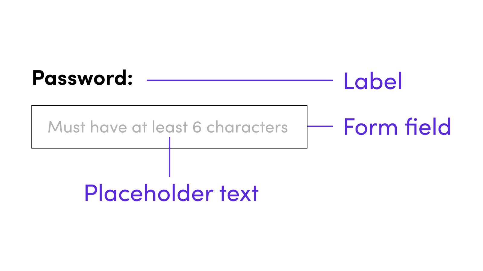
Keep labels and use them appropriately in the design of your forms. When designers hide descriptions or directions in their forms, they’re sacrificing usability in favor of simplicity. Add enough instructional text to your forms to create a good experience for all users, with or without disabilities.
Here are a few tools to help you check the accessibility of your website.
We already mentioned this one earlier but it helps to be reminded. This is especially important for CTA buttons and anywhere you are altering the text or background color. Use a contrast checker tool like this one from WebAIM to make sure it passes. If it doesn’t, just move the sliders until you get a combination that does pass.
This is a free web accessibility test that will determine how closely your website complies with the Web Content Accessibility Guidelines (WCAG) 2.1 standards. Submit your URL to be tested on webaccessibility.com. You’ll receive a compliance score with a list of actionable recommendations. Use these results to improve the accessibility compliance for your site.
If you want to dive into a more in-depth checklist of accessibility requirements, take some time to review this one from WebAIM. You can read through each individual guideline along with the accompanying recommendation.
If you want to learn more about color and how it impacts design, check out our post on What is color theory? Or check out other articles from the Flux blog where you can learn more on web design, Webflow, and freelancing.
If you’re looking for in-depth video tutorials on design, check out our YouTube channel where we publish new videos weekly.

If you want to learn more about the web design process from start to finish, consider checking out our program The $10k Website Process. You’ll discover a step-by-step process to design beautiful, high-value websites that achieve strategic goals for your clients. Master the art and strategy of website design, and increase the value of your services, as well as your rates.

Get our weekly updates, including high-value tips and free resources that will help you take your design career to the next level.