Get our weekly updates, including high-value tips and free resources that will help you take your design career to the next level.


As web designers, our job isn't just to create beautiful websites; our job is to create websites that are both visually stunning and user-friendly. The importance of usability in website design can't be overstated. If you've ever landed on a website that was aesthetically pleasing and yet impossible to navigate, you'll understand why.
Check out the video below from the Flux YouTube channel to hear Ran Segall's take on beautiful vs. usable website design:
A website with a good user experience helps users find what they're looking for quickly. This results in happy users, who are more likely to return to the site. Happy users are also more likely to convert into leads, customers, or subscribers. In other words, good usability is a win-win for both website owners and visitors.
If you're new to web design, or just not really sure where to start when it comes to improving website usability, you're in the right place. Keep reading to discover five important ways to improve the accessibility and usability of a website.
Optimizing a website for mobile is one of the most important things you can do to improve usability. And yet, a surprising number of active websites out there are still not mobile responsive.
In today's age of the smartphone, more than half of all web browsing is taking place on mobile devices. And that percentage just keeps increasing year after year. It goes without saying that websites that aren't mobile optimized are creating a poor user experience for the majority of individuals browsing the web.

If you're new to web design, you might be wondering: what does it really mean for a website to be mobile responsive? Here are three ways to ensure that a website is optimized for mobile:
Check out this article from Google to read more about the importance of mobile optimization.
Once you've implemented all the best practices for mobile optimization, it's important to run some tests to make sure that the website will actually perform well on mobile.
Here are a couple sites, both brought to you by Google, that you can use to test your websites for mobile performance:
The way a website's navigation is structured can make or break the user experience. Clear and simple navigation goes a long way in improving the usability of a website.
For e-commerce websites, the goal of the navigation should be to get users to wherever they need to go to make a purchase in as few clicks as possible. Too many roadblocks along the way can cause users to get frustrated or bored and ultimately give up. For example, requiring a user to create an account before purchasing anything could be considered a major roadblock, resulting in a lot of money left on the table.
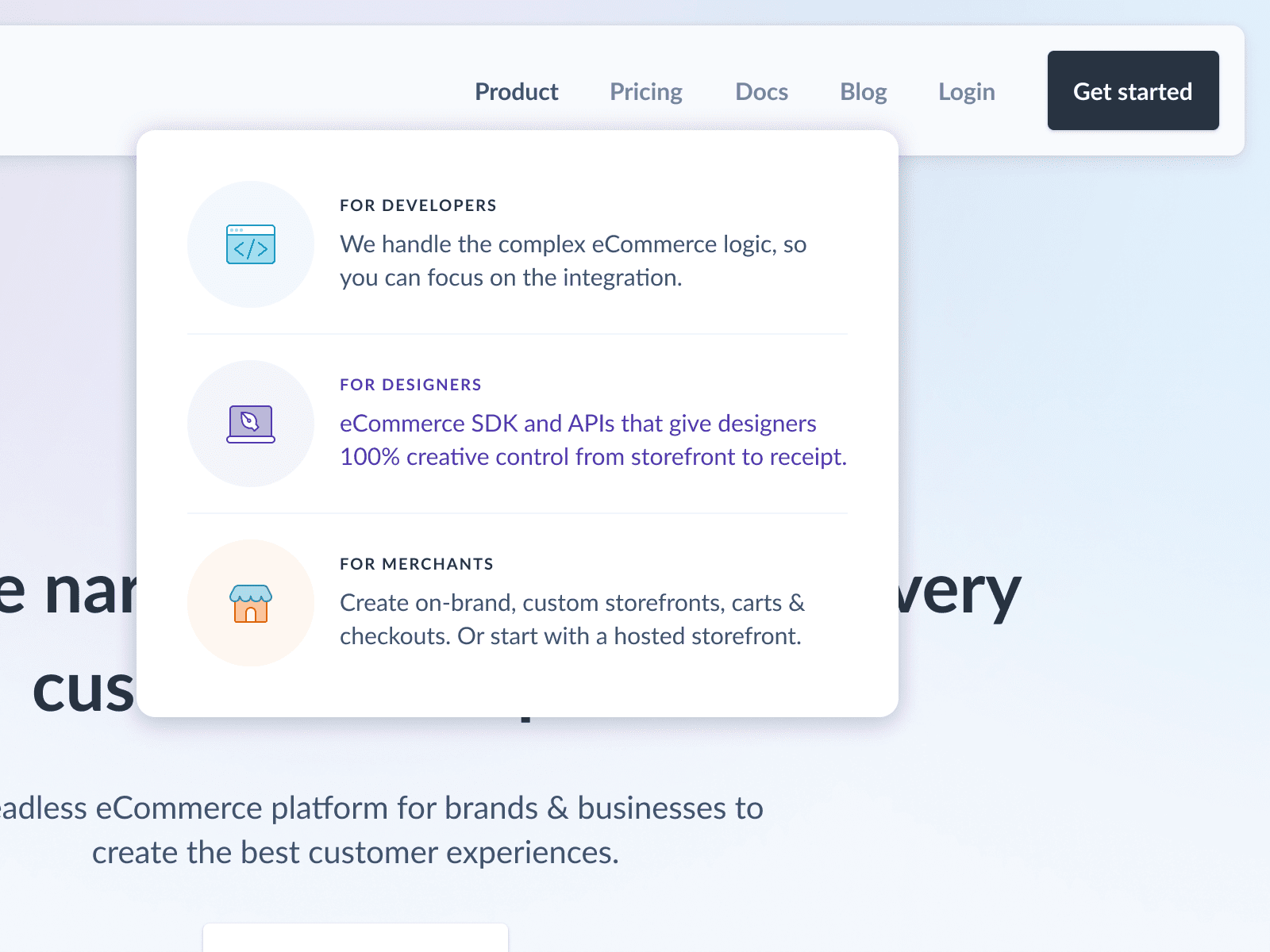
For websites that don't sell products, clear navigation is just as important. Most people land on a website with a particular goal in mind. The quicker they can achieve this goal, the better.
We often think of website navigation as the primary menu, but in fact this principle applies to all links and buttons on a site. As you scroll down a page, it should be clear which elements are linked to other pages, and what those pages are. A link that just blends in with the content is easy to miss and therefore doesn't create a good user experience.
Visual hierarchy is a principle of design that is used to draw attention to the most important elements in a design. Without visual hierarchy, the user has no idea where to look and what to focus on. Since clarity is key for usability, creating visual hierarchy in web design is a great way to improve the usability of a website.
Creating effective visual hierarchy is important for any type of design that is intended to communicate a message; however, it's especially important on the web, where you only have a few seconds to grab someone's attention.
There are a number of different techniques for using visual hierarchy to improve website usability. Here are some of the most common ways to create visual hierarchy in web design:
Click here to read more about visual hierarchy and how to achieve it in web design.
Web accessibility refers to the practice of creating websites that are accessible to individuals with cognitive, visual, auditory, motor, or speech disabilities. Creating websites that are accessible is not only good practice; it can even prevent lawsuits. A website that wasn't created with accessibility in mind could be seen as discriminatory towards disabled individuals.
But web accessibility doesn't just benefit individuals with permanent disabilities; it's good for everyone. For example, if you're browsing the web on a slow Internet connection, the images may not load, and if they don't have alt tags, you'd be forced to try to fill in the blanks yourself. If you want to watch a video but are in a setting where you can't use audio and there aren't any subtitles, you're out of luck. These are just two examples, but there are many ways an inaccessible website can create a poor user experience for disabled and non-disabled individuals alike.
So what can you do to improve the accessibility of a website? Here are four best practices to incorporate on every website you create:
Click here to read our in-depth guide on accessibility for websites.
When someone lands on your website, one of the things they're looking for, consciously or not, is evidence of your credibility. If you're creating content or offering services, people need to know that you're legitimate in order to trust your expertise. Simply put, credibility builds trust.
Credibility can be built into a business in many ways, but it's especially important on a website, which is often the first point of contact between a consumer and a business. Thus, designing your website with credibility in mind can give you a leg-up on the competition.
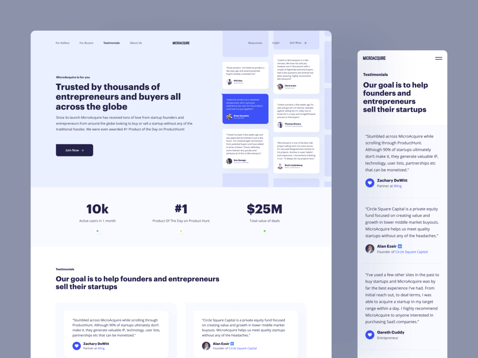
Fortunately, there are many ways to build website credibility that don't require winning the most prestigious awards in your industry. Here are a few tips for baking credibility into every website you create:
For more ways to build credibility on a website, check out this helpful article by Neil Patel.
In this post, we covered five of the most important principles for improving the usability of a website: mobile optimization, simple navigation, visual hierarchy, accessibility, and credibility. With these strategies in hand, you're well on your way to creating high-quality and user-friendly websites for your clients.
To get the best results out of the websites you create, however, it's important to combine the best practices of both usability and visual design. Our course, The $10k Website Process, teaches just that and more.
The $10k Website Process is a 9-module course that teaches Ran Segall's step-by-step process for creating high-value websites. With 12 hours of video content, done-for-you resources, and expert support, the course offers everything you need to know about the art and strategy of web design in one, comprehensive package.
Click here to learn more about the course and join our active community of over 3,000 professional web designers.


Get our weekly updates, including high-value tips and free resources that will help you take your design career to the next level.