Get our weekly updates, including high-value tips and free resources that will help you take your design career to the next level.


Color evokes emotion, sparks excitement, and grabs attention. Color can help draw your eye where you want it on anything from a poster or billboard to an email in your inbox. Color can even influence your mood. Did you know the color psychology behind a red and yellow combination makes you hungry? It’s no wonder well-known fast-food chains like McDonald’s use these colors in their logo.
Color theory is a set of principles for creating harmonious color combinations. It’s a mixture of science and art. Understanding the fundamentals of color theory and where color comes from is important to know as a designer. Once you master it, you’ll know how to create the best color combinations for your graphic and web design projects.
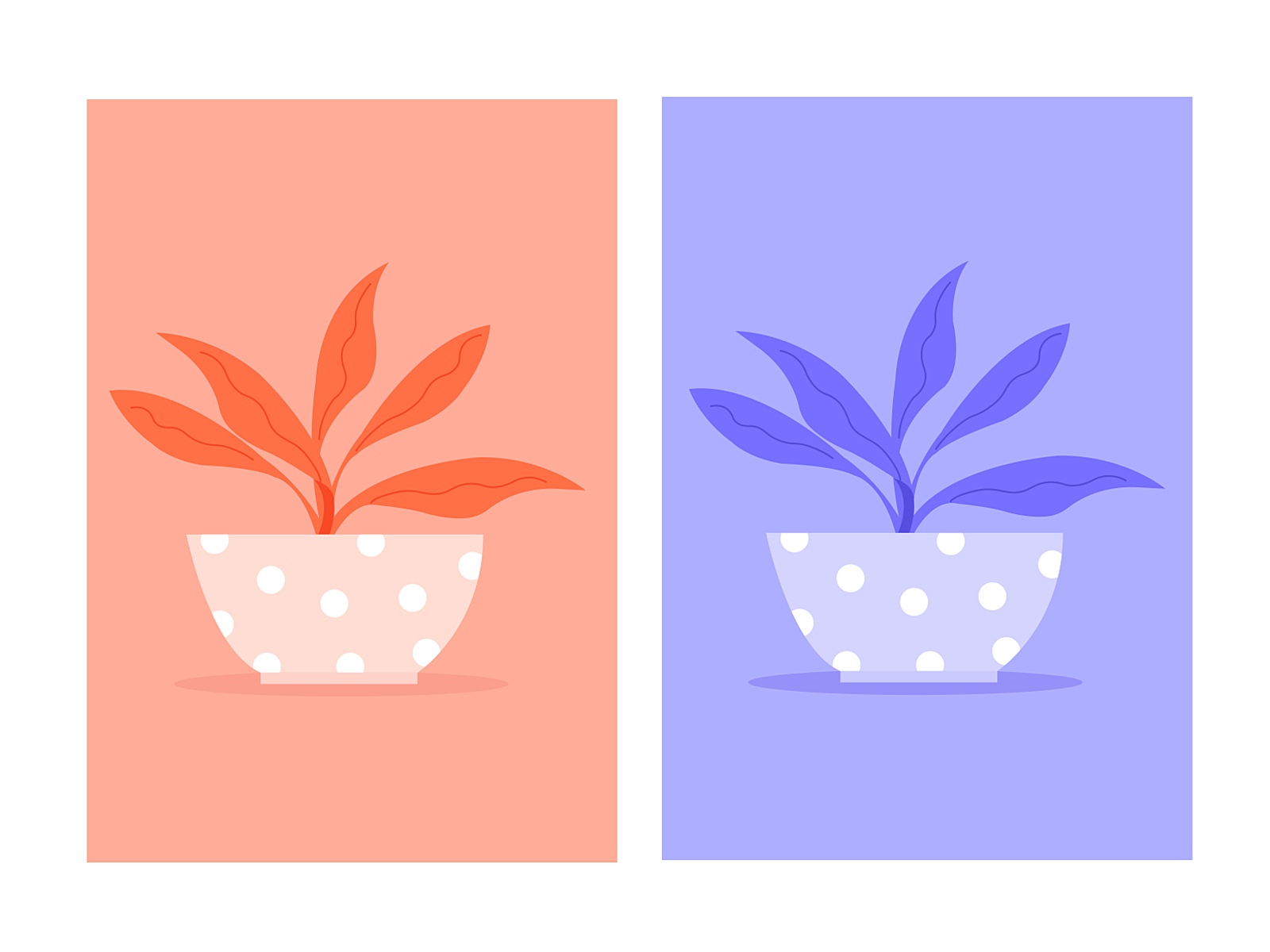
If you don’t believe color has an impact on your design then take a look at this example. It’s the exact same illustration, the only difference is the colors. Which one is pleasing to look at and which makes your eyes want to explode?

A significant part of color theory is understanding the color wheel. You’ve probably seen one in an early art class for school but what is it for and how can you use it to improve your designs? Once you understand the colors on the color wheel, the basic properties of color, and how to mix them, you’ll understand how to create rich color combinations that not only make your designs stand out but create a better user experience.
There are many versions of the color wheel but for this article, we’ll dive into a basic version. The color wheel is divided into 3 main categories: Primary, secondary, and tertiary color.

Primary colors are red, blue, and yellow. These are the three main colors you use to mix and create other colors. If you’ve even dabbled in painting, you know first hand how to mix just enough blue with yellow to make green.
When you mix two primary colors you get secondary colors which are green, orange, and purple.
Taking it one level further, when you mix a primary with a secondary color, you get tertiary colors. These colors are named after their parent, yellow-orange, red-orange, red-purple, blue-purple, blue-green, and yellow-green.
Check out this color wheel tool created by Canva. You can start with one color, choose options to create monochromatic, complementary, analogous, triadic, and tetradic combinations.
The color wheel is divided in half by warm and cool colors. The warmth or coolness of a color is known as color temperature. Think about how you can use warm and cool colors in your web design projects to achieve a certain mood.
If you practice photography, you know how lighting and color temperature affects how your camera captures the photo. Using white balance and editing in post helps to correct some of these imbalances.

Before we can create richer color combinations, we need to understand a few basic terms of color theory, what they are, and how they affect color.

A hue is pure color. Basically, it’s any one of the colors on the color wheel.
Saturation refers to the intensity of a color. When you use a saturation adjustment layer in Photoshop, you can see exactly how this affects the color intensity of your photo. Move the slider to the right for bright saturated colors. Move the slider to the left for desaturated or grayscale.
Luminance refers to the amount of brightness or light in a color.
You understand primary, secondary, and tertiary colors but how do you get more deep and complex colors? This is where tints, tones, and shades come into play. Once you start playing with these, you open up an infinite amount of color options.

A tint is created by adding white to a base hue, lightening the color. This makes a color less intense and is useful when balancing more vivid color combinations.
A tone is created by combining black and white — or grey — with a base hue. Like tints, tones are subtler versions of the original color. Tones are less likely to look pastel and can reveal complexities not apparent in the base color.
A shade is created by adding black to a base hue, essentially it’s darkening the color. This creates a deeper, richer color.
Color schemes are an important aspect of color theory. A color scheme is a combination of colors that when put together create a harmonious match. As a designer, it’s up to you to decide what color scheme suits the goal of your project. Let’s break down a few of the main color schemes.

“Mono” is a prefix meaning one or only, in this example one color. For this color scheme, you start with one hue (for example, red) then use tints, shades, and tones to lighten or darken to make a harmonious color combination.
Monochromatic color palettes can be pleasing to the eye but remember to add contrast, especially when it comes to web design. If a whole website is in a monochromatic color scheme, it may be difficult for the user to find what they’re looking for.
Complementary colors are two colors on opposite sides of the color wheel. Examples of complementary combinations are yellow and purple, blue and orange, red and green.
Due to high contrast, complementary colors can add fun and excitement to websites but just as with a monochromatic color palette, use it thoughtfully. You’ll also want to add a few more colors, especially for typography.
A split-complementary color scheme is a step beyond the complementary scheme. Instead of using only one color as a compliment, you use two colors next to each other on the wheel to compliment your main color.

These are three colors that sit right next to each other on the color wheel. An example of analogous colors is yellow, yellow-orange, and orange.
Analogous color palettes are a favorite of mine! Pairing this color scheme with neutral and basics like white, black, and gray can create beautiful websites.

Triadic are any three colors evenly spaced on the color wheel. When you connect the dots, they form a triangle.

Whether use use RGB or CMYK is highly dependent on what you’re designing for. It’s important to have a basic understanding of both color models to make sure you’re designing in the correct one. The last you want is to hand off incorrect files to your client.
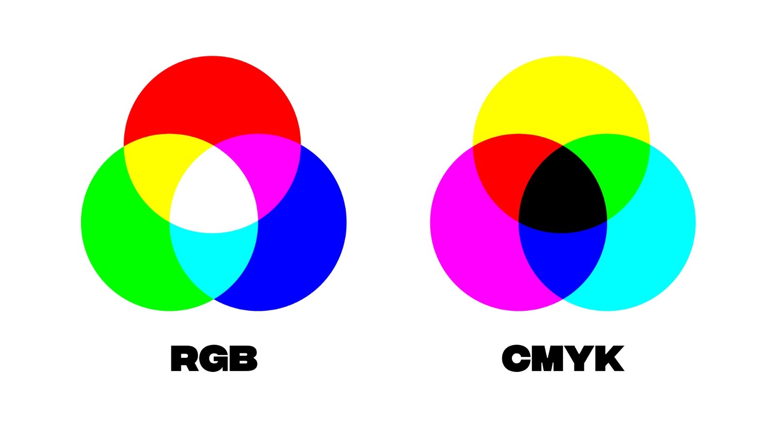
The RGB color model is an additive color model. Red, green, and blue light are combined together in various ways to create a broad range of colors. RGB are the initials of the three additive primary colors, red, green, and blue. The more light you add, the brighter the color mix becomes. If you mix all three colors of light, you get pure, white light.
Cameras, TVs, and computer screens use RGB to create their colors. If you open a photo in Photoshop, you’ll notice the color space is set to RGB.
If you’re mainly a user interface or web designer, you design in RGB. But if you every work on a print project, you’ll use the CMYK color space.
While RGB is an additive color model, CMYK is a subtractive color model. CMYK stands for cyan, magenta, yellow, and black. When you buy ink for a printer, usually you’ll need to buy an ink cartridge for each of these.
A printing machine creates images by combining CMYK colors to varying degrees with physical ink. This is known as subtractive mixing. All colors start as blank white, and each layer of ink reduces the initial brightness to create the preferred color. When all colors are mixed together, they create pure black.
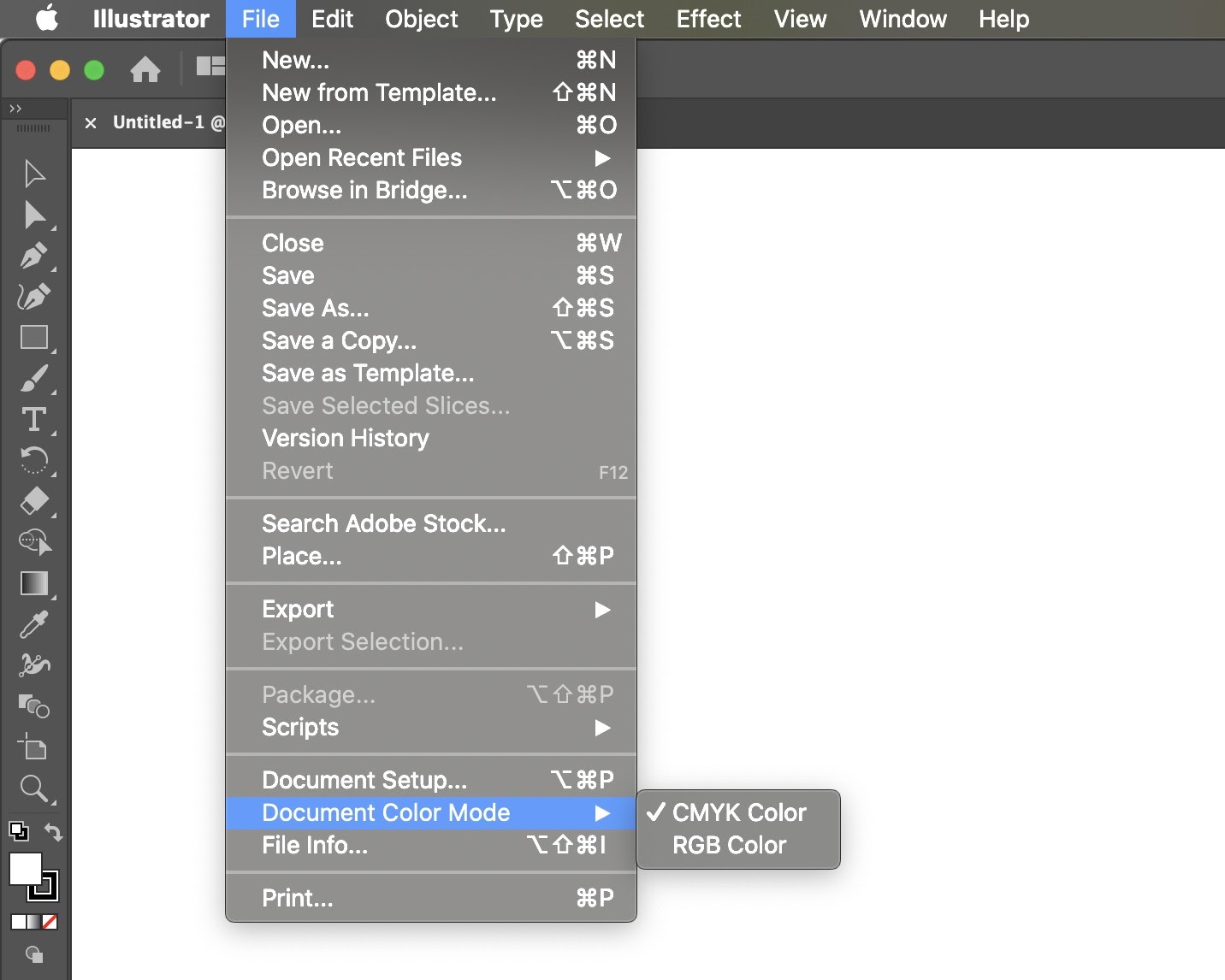
For any design project you intend to print, make sure your document color space is set to CMYK. To do this in any Adobe program go to File > Document Color Mode. If you’re using software used specifically for screen design like Figma or Sketch, you can skip this step. For other dual-design software, there should be a similar option to switch the Document Color Mode.
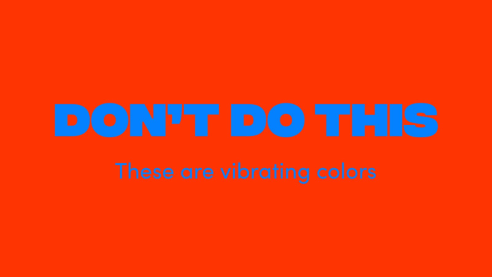
Have you ever noticed how some color combinations feel harmful to the eyes? Vibrating colors are when two high contrast colors are put together. Some examples of these combinations are blue and pink, green and orange, or red and purple. Avoid using these color combinations for good user experience.
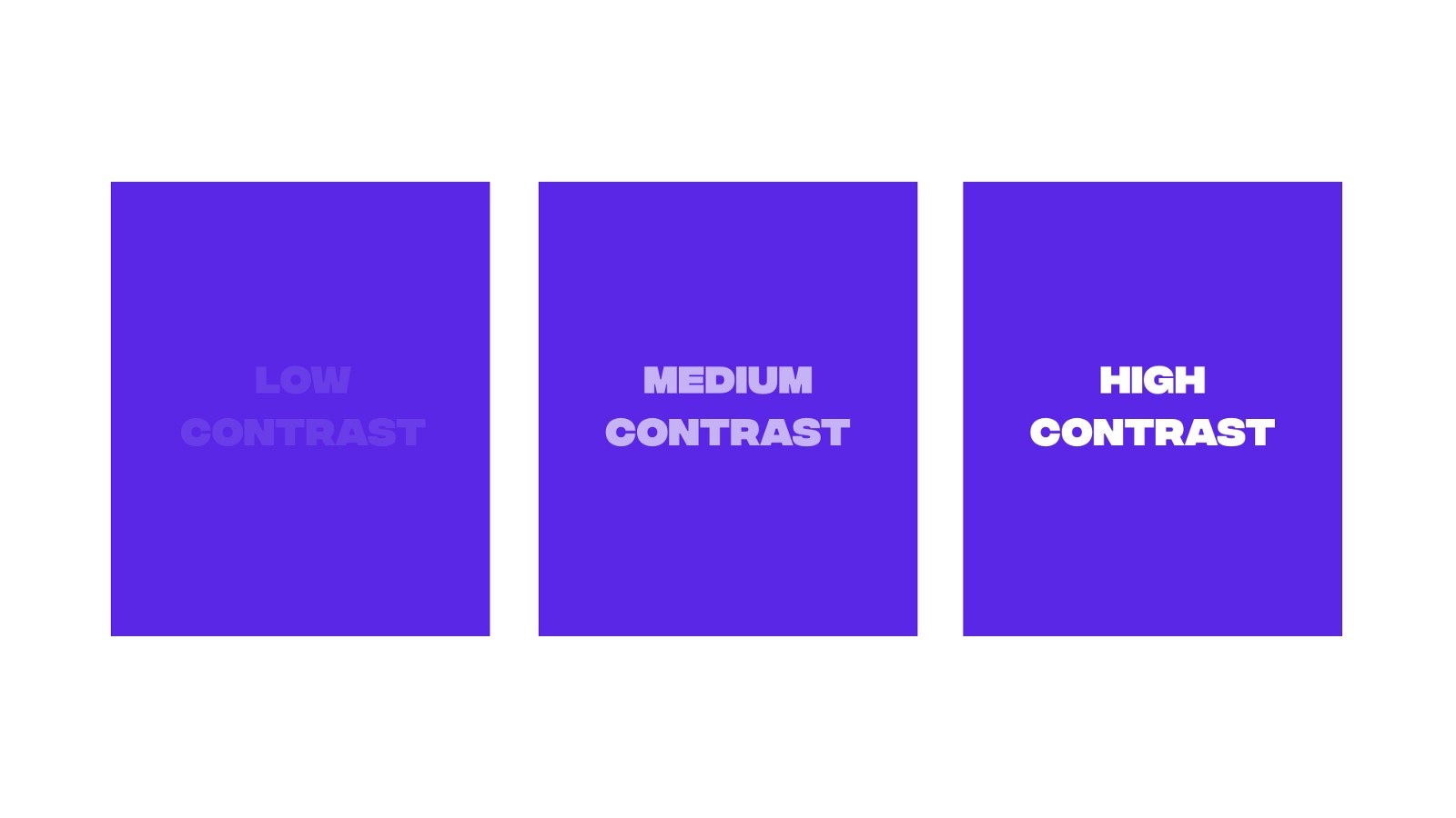
Try not to choose colors that are too similar in hue or value. You want your colors to provide contrast. When it comes to designing for the web, contrast is even more important to keep in mind for typography.
Take a look at this example, which one do you find difficult to read? Which one is easy on the eyes and clearly legible? If your user can’t read your message then you’re not communicating well with your design.
Use this tool to check the contrast for your design. Once you add the foreground and background color, make sure it passes the test. They also explain the contrast ratio requirements which are important for digital design.
Color affects the mood of your design so you want to have a general idea of color psychology when choosing your main colors. For example, red is often associated with anger, danger, heat, and passion. How many times have you been asked to make the CTA button red? Yes, red can help draw attention to a landing page but if everything is red, then nothing is important. It’s a strong color so you want to use it sparingly to call attention.
Blue is associated with water, peace, and calm. It’s even found in research to result in lowering heart rates (compared to red which is found to raise heart rates). Corporate companies often use blue for their logo and brand colors, it’s a safe color choice. However, if you’re designing a logo for a company and you want to stand out, you may want to disrupt the industry by choosing a completely different color.
To understand more about the psychology of color and how to use it as a web designer, check out our post to learn more.
Maybe you find it difficult to come up with color combinations from scratch on your own. A tip to inspire and help you find a good color palette for your next design project is to create a moodboard.
Gather several photos, illustrations, and designs. What suits the mood you’re going for? Be sure to ask your client these questions first before you go searching, to make sure you’re on the right track. Once you start collecting inspiration, you’ll find several different combinations.
Adobe Color is a tool I find myself coming back to repeatedly (formerly named Adobe Kuler). While searching for design inspiration, maybe you come across a photo with captivating colors. You can actually upload the photo directly to Adobe Color and extract a color palette from it! The tool even gives you the hex color codes to easily copy and paste into your design software.
You can also use a color wheel to explore and create monochromatic, complementary, analogous, and other color schemes. Once you create a color palette you like, you can save it when logged into your Adobe account.

Check out this lesson of our free web design course where Ran shares how to pick the right colors for your websites, how to combine them with other colors to create a great user experience, and how to explain to your clients why you chose the colors you chose.
Color theory, like typography or coding, is a skill you can master. Start to notice how color is used around you. If you find something catches your eye, it could be the color used. Take note, learn from it, and apply it in your next design.
We include a lesson on how to use color effectively in our $10k Website Process course. It’s just one of many lessons on not only how to design a beautiful and memorable website but how to define a winning strategy, how to structure your website with wireframes, how to develop and work with $10k clients. Learn more about the course here.


Get our weekly updates, including high-value tips and free resources that will help you take your design career to the next level.