Get our weekly updates, including high-value tips and free resources that will help you take your design career to the next level.


When you are beginning to learn to design, one of the fundamentals you will need to practice is visual hierarchy. Even if you have never heard of hierarchy and know what it means in design, you have likely created it by accident. Let me explain what I mean with an example.
You are designing a poster for an event, how do you start? What is the most important thing you need to feature on the poster to advertise this event? Probably the name of the event. What is it? After all, if people don’t know what the event is, how will they decide if they want to attend? Take a look at this poster design example.
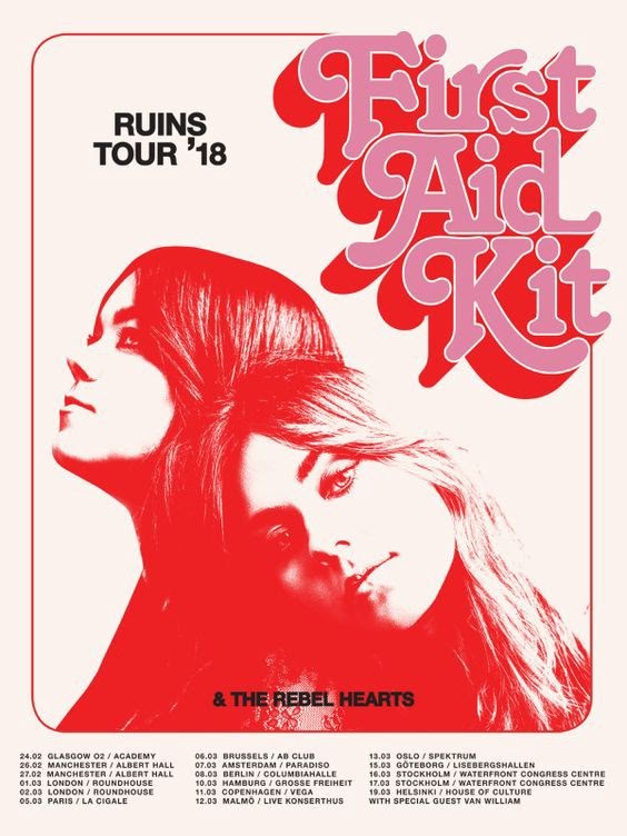
In this case, the event is a who. It’s a concert with First Aid Kit as the headliner. Since the “who” is the most important takeaway for this poster, the typography for the artist’s name is one of the largest elements followed by a photo of them. Once someone sees this and their interest is piqued, then they’ll walk up and look closer at the details of the poster. They will scan through the concert event dates and the locations next. If this text was also as large as the artist’s name, there would be no visual hierarchy. It would also be incredibly difficult to read and not a pleasing design.
If you’ve ever designed a concert poster, like the above, you have likely made the same design decision. Whether you realized it or now, you were using visual hierarchy to draw the attention of a passerby. But visual hierarchy isn’t just for poster design. We need it in all forms of design from books to logos to websites and apps.
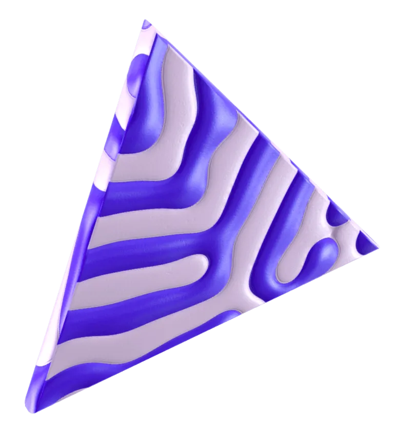
Looking for more examples of visual hierarchy? Check out this post on Visual Hierarchy Examples. Here’s a sneak peak at one more example.
Now we understand why we need to create visual hierarchy for an event poster, but about web design? Is it important to consider hierarchy when designing a website? Absolutely. In fact, it’s even more important.
On the web, attention is fleeting. You have about 5 seconds to grab someone's attention and walk them through an experience before they exit out and try another result. When you’re designing websites for a client or even your own website, it’s no different. You’re creating the website for a reason, usually to sell a product or service for a business. This means the end goal for the website is a transaction or at least to create warm leads.
Each individual landing page you design for a website should have its own visual hierarchy to support the goal of that page. If all the text on a webpage is the same size, typeface, and color, no one would read it or stay on the site for too long. By drawing attention to a few elements, we can help guide the user through the website experience, educate them on the business, and face them in the direction of action.
Check out this video where Ran walks you through why hierarchy is so important in web design.
Now we know what hierarchy is but how do we create it in our own designs? Here are some design fundamentals to consider when creating good visual hierarchy.
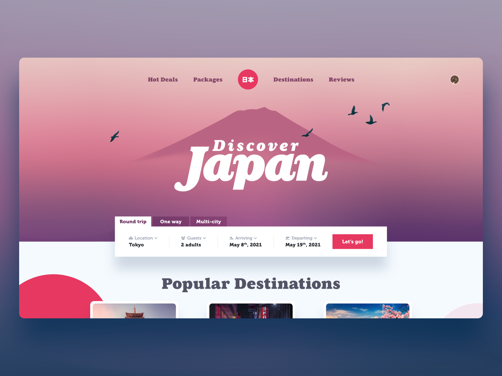
One of the simplest ways to create hierarchy is simply to vary the size of one element greatly. Here’s a landing page example that uses scale for the headline “Discover Japan”. Immediately, we understand that this is a travel website. After the headline, we see details for a round trip, one way, and multi-city trip, a user understands that this is a booking site to purchase flights. The atmospheric illustrations in the background help set the mood for the destination.
Action tip: Choose one element of your landing page design, it can be the headline, a photo, or illustration, and make it the largest to help give focus to the design.
A fun way to create visual hierarchy and bring personality to your design is to consider using color in a strategic way. In the beginning stages of your design, it’s helpful to create moodboards and create color combinations to help focus your design.
To learn more about color theory and help you create amazing color combinations, check out this post on What is color theory?
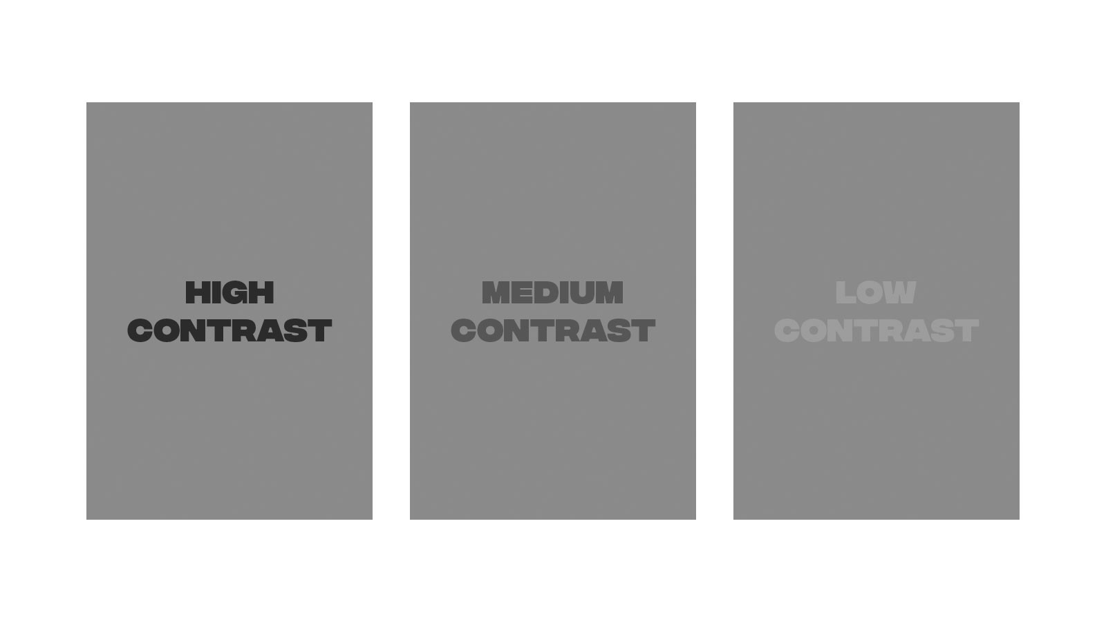
Rather than using every color of the rainbow, what colors make sense to use for your design? Does it call for a monochromatic design with one pop of contrast? Maybe you want to focus on warm or cool colors to help set a certain mood. Color can greatly influence the hierarchy of your design, take a look at this example.
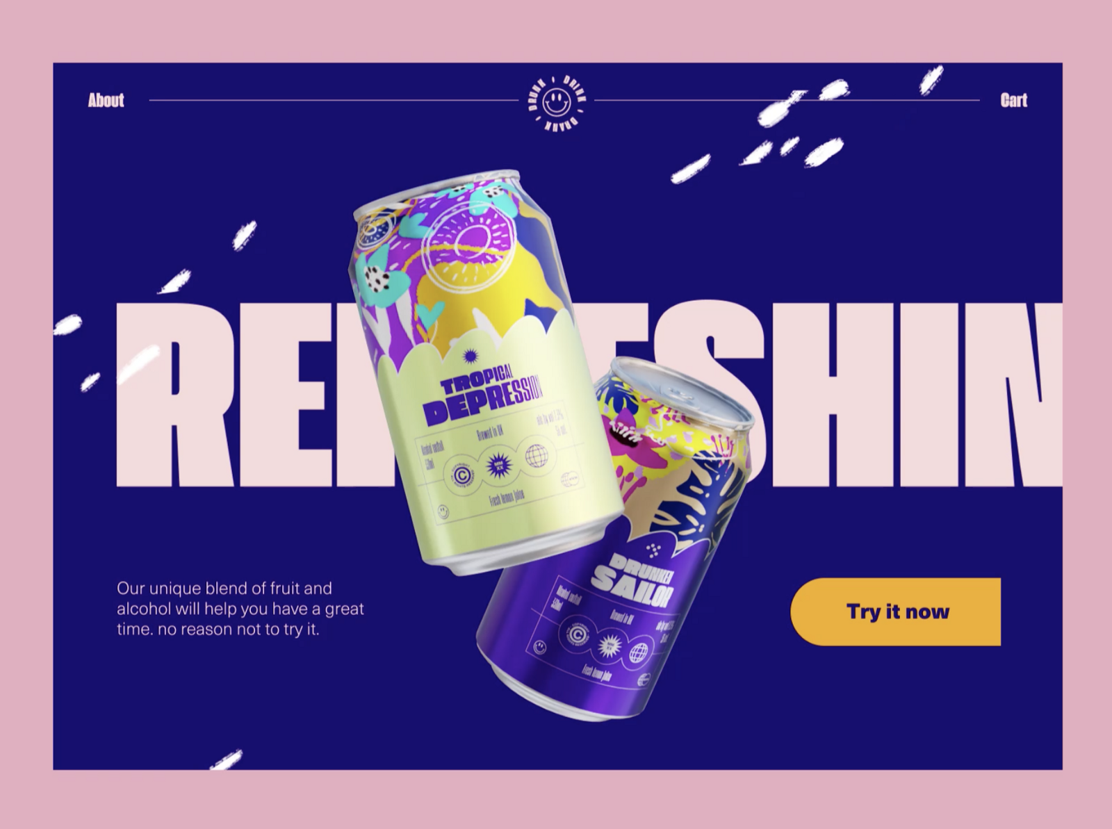
This design is fresh and bold. The designer chose to use a deep royal purple as the background and have the word “Refreshing” reversed out in a bold and condensed typeface. Whenever you use color and contrast to create this reverse-out effect, you’re creating hierarchy. This purple background helps the tropical canned beverages stand out. After seeing this design (especially in motion), would you want to try the drink?
Action tip: Before you design anything, create a moodboard and pull several possible color palettes. This will help speed up your design process when you start designing the UI of the webpage.
Negative space, also known as whitespace, is how you divide and arrange elements within a designated area. When you’re a new designer, it’s tempting to fill every pixel of your artboard with design but this is a novice mistake. Whitespace is your friend, use it to help frame more important elements of your design. Take a look at how negative space is used in this landing page design.
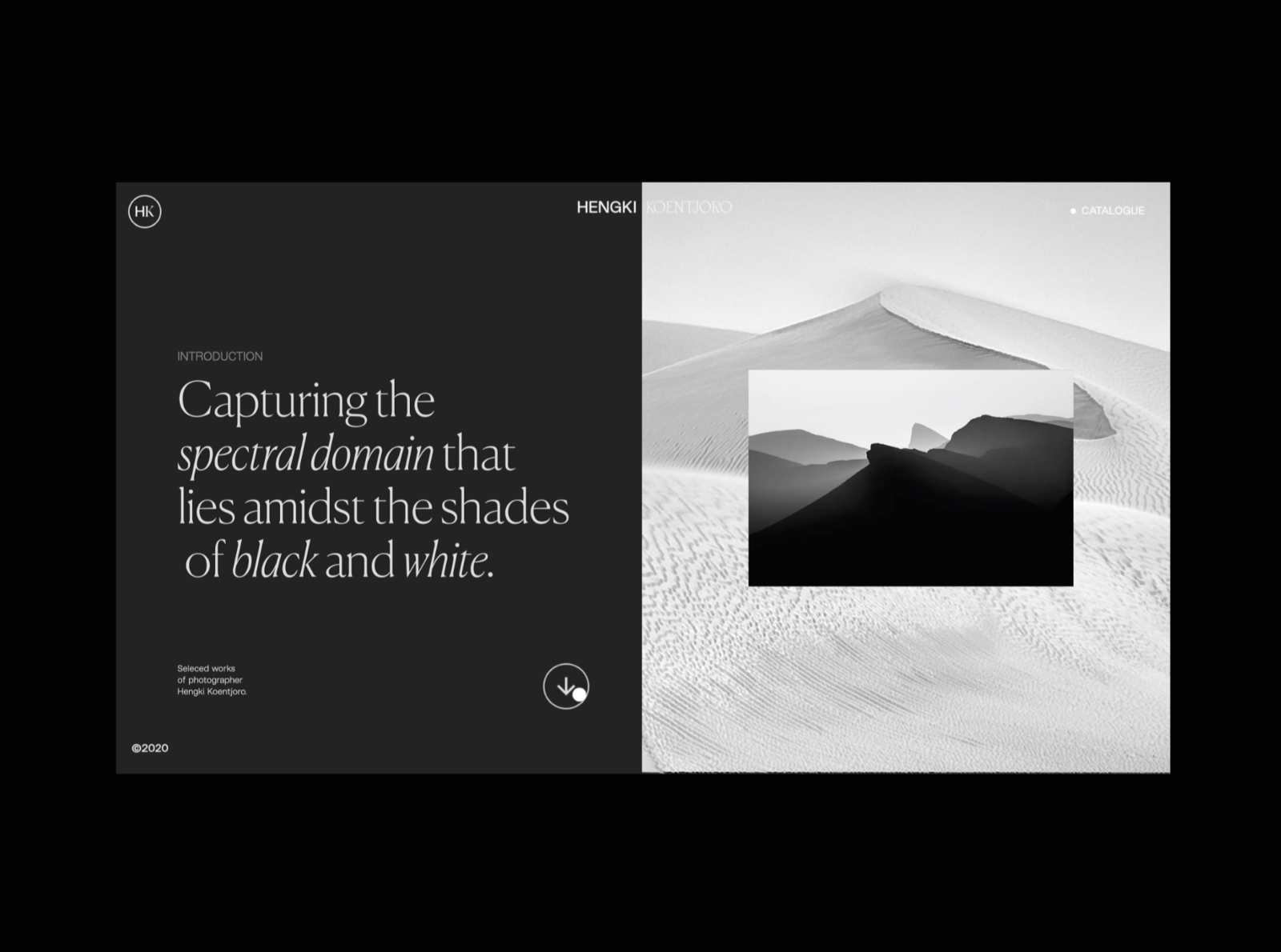
This page happens to use a split design in an effective way. On the left side, we have white large elegant typography reversed out on black, surrounded by a healthy amount of negative space. The same can be said of the black and white photography section on the right. There’s something so pleasing about the symmetry and spacing of this design, it helps calm and direct a user to one section at a time.
Action tip: When you’re designing, create multiple options. Think about how to use negative space along with scale and color to create a few different options. Even with the same content, there are so many ways to design a solution.
Similar to negative space, alignment is where an element is placed in regards to surrounding ones usually through the use of a grid. Using a grid for alignment is important in web design. Without a grid, your design will look unorganized and become difficult for a user to read the content of a website.
To learn more about grids and how to use them in your web design projects, check out How to use a grid in web design.
The more information there is on a webpage, the more of a need there is for a grid and good alignment. Here’s an example of how alignment helps create hierarchy to the design.
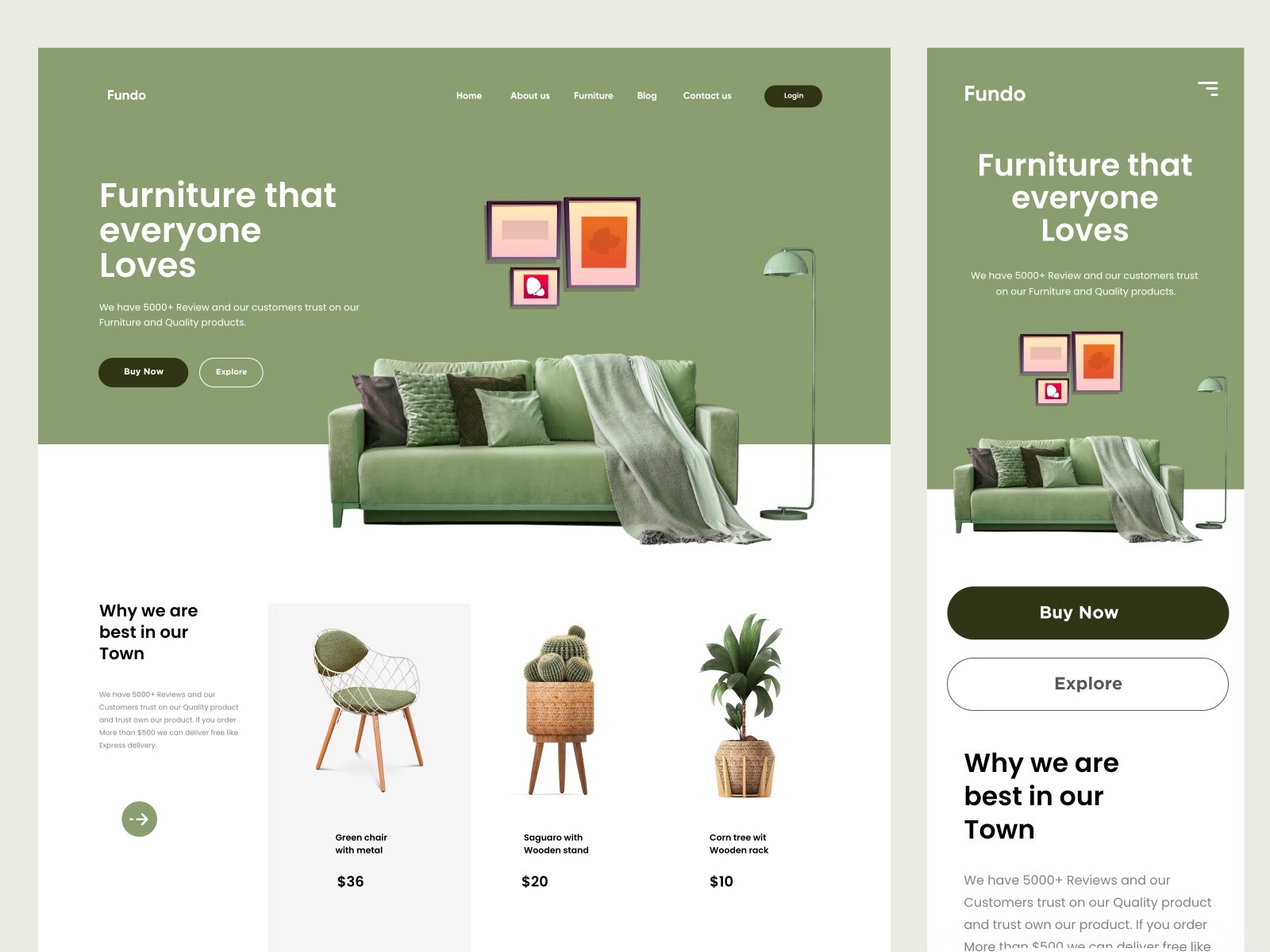
Notice how the grid is split up on the desktop version of this landing page. The product section shown below the fold is split up into 4-columns. This helps direct our eyes easily from the content in the first column “Why we are best in our town” to 3 different products. Using columns and rows to help guide the user’s eyes from left to right will help keep them engaged and able to find what they are interested in.
Action tip: Before pushing any pixels in your favorite design program, create a simple grid first. (Trust me, you will thank yourself for it later). Instead of randomly placing a headline and photo here or there, you’ll have a purpose for where you’re placing your design elements.
We’ve covered the top 4 ways to create visual hierarchy in design. But there are so many design elements and principles that can help you create harmony to your designs while also creating a strong hierarchy. Some of these include line, shape, value, texture, contrast, repetition, and movement.
To learn more about these visual design elements and principles, check out this post on The visual design elements and principles that make good design.
We’ve gone over quite a few design fundamentals here in this article on visual hierarchy and shown you examples with good design to follow. But what if you’re craving more design content?
Check out other articles from the Flux blog where you can learn more on web design, Webflow, and freelancing. If you’re looking for in-depth video tutorials on design, check out our YouTube channel where we publish new videos weekly.
Want to learn more about how to create a stunning and interactive portfolio with Webflow? Check out our Webflow style guide so you can design faster.
If you want to learn more about the web design process from start to finish, consider checking out our program The $10k Website Process. You’ll discover a step-by-step process to design beautiful, high-value websites that achieve strategic goals for your clients. Master the art and strategy of website design, and increase the value of your services, as well as your rates.


Get our weekly updates, including high-value tips and free resources that will help you take your design career to the next level.